Tuesday, May 1, 2012

Soda Can Folder Design

Folder Design Ideas - Alcohol
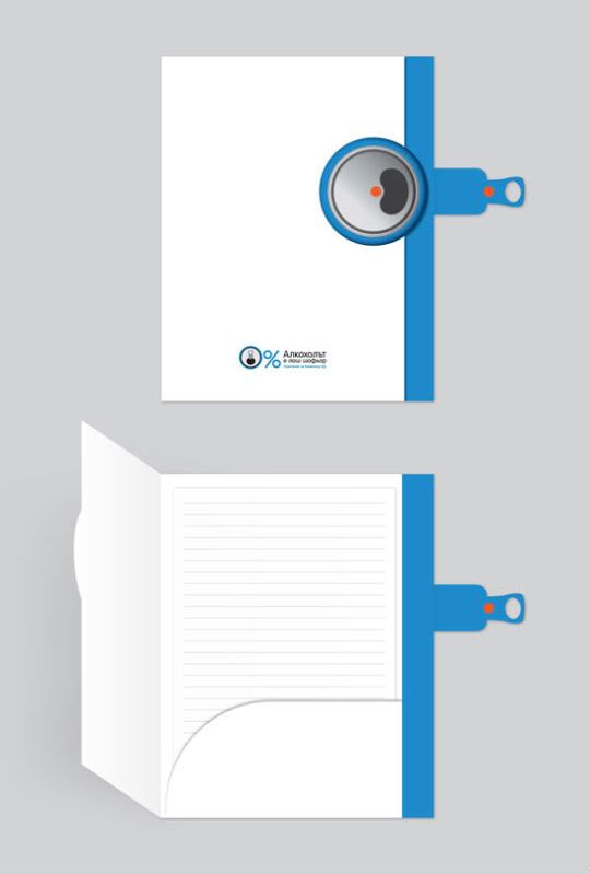
This folder looks like it's imitating a soda can. On the side of the folder they have a top of a soda can, and then they have a tab on the side that looks like the metal part you pull to open the can. It looks like you can pull the side tap to open the folder up. They have some information at the bottom, but I don't know what it says. The used the image of the top of the soda can to make it into a 0% sign, which I thought was creative. I like how the front of the folder is white and the side of the folder is blue. The folder only has one inside pocket, which is on the right side. I like that the inside pocket has a curved edge instead of the usual straight edge. I haven't seen a folder like this before. I think it's a creative folder design.

Texture folder

Folder Design Ideas - NiC
This is a different type of folder. It looks like it has some texture on the front of the folder. I like how the front of the folder is designed with one side being slightly lighter than the other side. The logo is near the bottom on the left side. I like the three blue dots on the right side. They have a right inside pocket that goes up about half-way on the folder and they also have a business card holder. They have a side pocket on the left side. I like how the same three dots are now cut-out. I think it's interesting that one side has a front pocket and the other side has a side pocket. This folder is different from most. I think it's a well designed folder.

Monday, April 30, 2012

Awesome Folder Design

Folder Design Ideas - Then
I really like this folder. I think this is a well designed and very useful folder. The front of the folder has a black flap that folds up and the orange part is stationary. I like that they placed their logo in the centered at the top. I like how they use mostly black for the top part and then some orange for the bottom part. I like folders with two or more different colors that divide a section up. They have one big pocket inside the folder, and I can see that it fits regular size paper in it. There also have a business card holder and another slot for another piece of paper. I like how the inside pocket has a curved edge instead of a straight edge. It adds character to the folder. I would definitely use this folder.   

Cute Folder


Folder Design Ideas - Hello!
This is an interesting folder design. I see where there is a white slot to put the name of a business on. It looks like the folder folds in half once, and there is one pocket for papers. I noticed that there is also a business card holder on the front pocket. I think this is a cute and unique folder design. It doesn't look like you can fit regular size paper in there, but it's hard to tell from the picture.

Phone Stand Flyer

 This is a flyer for a stand for smart phones. I don't know if this is a good flyer or not. It seems a little crowded, but I know there is a lot of information on the flyer. They have some information at the top explaining what the stand does. This company is trying to sell their phone stands. They have a several views of their stand with a phone on it. There also have the price of their stand. There show all of the colors that the stand comes in and they even have a custom wrap available. I don't like the font choice up top, but maybe that's what their logo looks like. It does make my eye move around the page. It's good that they give their readers a lot of information.

Friday, April 27, 2012

Creative Folder Design

Folder Design Ideas - Globya

I really like this folder design. I like the repetition of the black dots across the entire folder. I like the movement of the lines on the front, and I also like how the blue dots pop out on the side. I can see that there is a part of a white line on the fold on the back of the folder. I like how the information is centered at the bottom on the back of the folder. I like the inside of this folder too. I like how they repeated the lines on the inside of the folder, but made them black instead of white. I like the right blue inside pocket. I noticed that they put their logo and information on the blue inside pocket. I think this is a very creative folder design. I know this isn't a regular/typical business folder design, but I have seen folders like this before.   

Unknown Company Folder Design


I don't know what type of company this is. I like how the front and the back of the folder ties in together. The front and the back both use the blue and white rectangle, but the front has their logo on it and the back doesn't. I noticed that they used one of the symbols from their logo (blown up) on the front, and then on the back they used a different symbol. I don't see the website, phone number, or address on this folder unless it's on the inside pocket. The white rectangle on the back would be a good place to put information at. I like the simplicity of the inside pockets. Both pockets are blue with a white line going across the top and bottom. I noticed that they put the logo along with other information only on the left inside pocket. I really want to know what type of company this is because this folder is pretty simple and I wonder if the design matches what the company does. I think this is still a good folder design though.