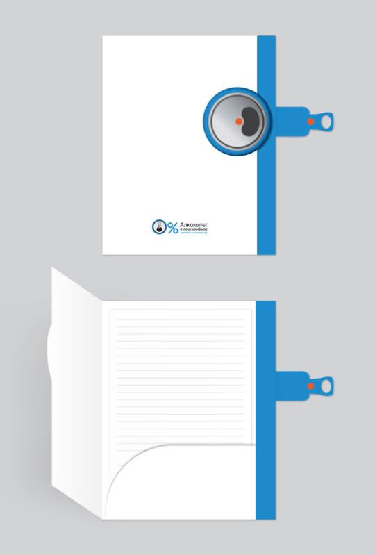
This folder looks like it's imitating a soda can. On the side of the folder they have a top of a soda can, and then they have a tab on the side that looks like the metal part you pull to open the can. It looks like you can pull the side tap to open the folder up. They have some information at the bottom, but I don't know what it says. The used the image of the top of the soda can to make it into a 0% sign, which I thought was creative. I like how the front of the folder is white and the side of the folder is blue. The folder only has one inside pocket, which is on the right side. I like that the inside pocket has a curved edge instead of the usual straight edge. I haven't seen a folder like this before. I think it's a creative folder design.
No comments:
Post a Comment