Tuesday, May 1, 2012

Soda Can Folder Design

Folder Design Ideas - Alcohol
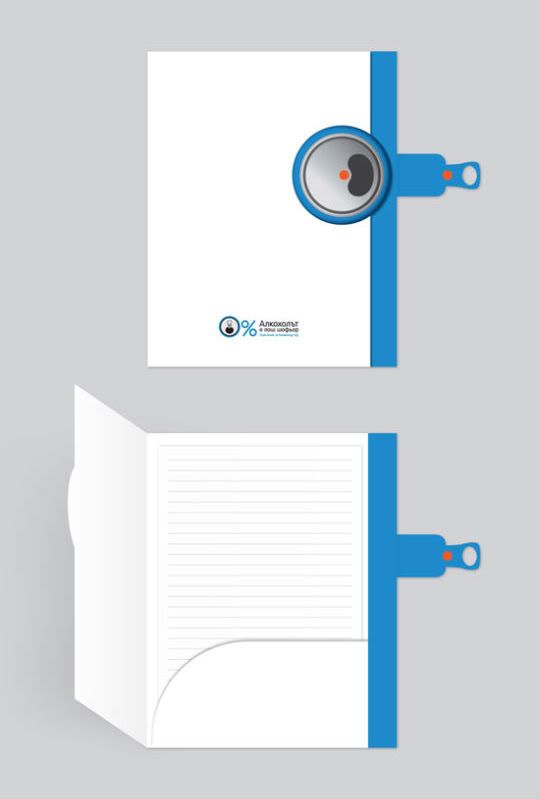
This folder looks like it's imitating a soda can. On the side of the folder they have a top of a soda can, and then they have a tab on the side that looks like the metal part you pull to open the can. It looks like you can pull the side tap to open the folder up. They have some information at the bottom, but I don't know what it says. The used the image of the top of the soda can to make it into a 0% sign, which I thought was creative. I like how the front of the folder is white and the side of the folder is blue. The folder only has one inside pocket, which is on the right side. I like that the inside pocket has a curved edge instead of the usual straight edge. I haven't seen a folder like this before. I think it's a creative folder design.

Texture folder

Folder Design Ideas - NiC
This is a different type of folder. It looks like it has some texture on the front of the folder. I like how the front of the folder is designed with one side being slightly lighter than the other side. The logo is near the bottom on the left side. I like the three blue dots on the right side. They have a right inside pocket that goes up about half-way on the folder and they also have a business card holder. They have a side pocket on the left side. I like how the same three dots are now cut-out. I think it's interesting that one side has a front pocket and the other side has a side pocket. This folder is different from most. I think it's a well designed folder.