Monday, April 30, 2012

Awesome Folder Design

Folder Design Ideas - Then
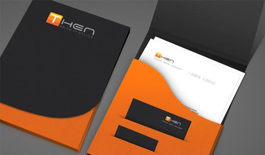
I really like this folder. I think this is a well designed and very useful folder. The front of the folder has a black flap that folds up and the orange part is stationary. I like that they placed their logo in the centered at the top. I like how they use mostly black for the top part and then some orange for the bottom part. I like folders with two or more different colors that divide a section up. They have one big pocket inside the folder, and I can see that it fits regular size paper in it. There also have a business card holder and another slot for another piece of paper. I like how the inside pocket has a curved edge instead of a straight edge. It adds character to the folder. I would definitely use this folder.   

Cute Folder


Folder Design Ideas - Hello!
This is an interesting folder design. I see where there is a white slot to put the name of a business on. It looks like the folder folds in half once, and there is one pocket for papers. I noticed that there is also a business card holder on the front pocket. I think this is a cute and unique folder design. It doesn't look like you can fit regular size paper in there, but it's hard to tell from the picture.

Phone Stand Flyer

 This is a flyer for a stand for smart phones. I don't know if this is a good flyer or not. It seems a little crowded, but I know there is a lot of information on the flyer. They have some information at the top explaining what the stand does. This company is trying to sell their phone stands. They have a several views of their stand with a phone on it. There also have the price of their stand. There show all of the colors that the stand comes in and they even have a custom wrap available. I don't like the font choice up top, but maybe that's what their logo looks like. It does make my eye move around the page. It's good that they give their readers a lot of information.

Friday, April 27, 2012

Creative Folder Design

Folder Design Ideas - Globya

I really like this folder design. I like the repetition of the black dots across the entire folder. I like the movement of the lines on the front, and I also like how the blue dots pop out on the side. I can see that there is a part of a white line on the fold on the back of the folder. I like how the information is centered at the bottom on the back of the folder. I like the inside of this folder too. I like how they repeated the lines on the inside of the folder, but made them black instead of white. I like the right blue inside pocket. I noticed that they put their logo and information on the blue inside pocket. I think this is a very creative folder design. I know this isn't a regular/typical business folder design, but I have seen folders like this before.   

Unknown Company Folder Design


I don't know what type of company this is. I like how the front and the back of the folder ties in together. The front and the back both use the blue and white rectangle, but the front has their logo on it and the back doesn't. I noticed that they used one of the symbols from their logo (blown up) on the front, and then on the back they used a different symbol. I don't see the website, phone number, or address on this folder unless it's on the inside pocket. The white rectangle on the back would be a good place to put information at. I like the simplicity of the inside pockets. Both pockets are blue with a white line going across the top and bottom. I noticed that they put the logo along with other information only on the left inside pocket. I really want to know what type of company this is because this folder is pretty simple and I wonder if the design matches what the company does. I think this is still a good folder design though.

Student folder design


I think this is a folder design by a student. I'm not sure what language it's in though. I like the picture of the ballet shoes and I like how one shoe is blue and the other shoe has red lacing. It ties in to the rest of the colors on the folder. I like the curvy line on the back and I like how he separated the information. My eye goes from the top logo to the middle design and then down to the bottom. He centered the information at the bottom, which I like, but I noticed that the other 2 pictures/information is either on the left or right side. I think that works well. The only thing I don't like about this folder is that the blue line on the front and the blue line on the back don't match. It would be better if the two lines were one line that went from the back to the front.

CPI Folder Design

 I like this folder design. It reminds me of my folder design because they both use curved lines. I like how there are 3 lines that come together to join in a big white rectangle. I can see the fox (the logo) running down the lines. I also like the pop of orange on the side. I'm not sure what the back of this folder looks like, but it would be cool if the lines followed on to the back of the folder. I think this is a well design folder.

Monday, April 23, 2012

Two Toned Folder Design

Press release folder Designs samples 
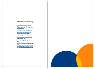
This is a business companys' folder design. It's very simple. I think it's a little boring, but I don't know what the company does, so this design might fit what the company does. http://www.maadesigns.co.uk/portfolio/presentation_folders/press_release_folder_design.htm On this website it says it's a press release folder design. The one thing I do like about this design is that the inside pockets are two different colors. The right inside pocket is dark blue and the left inside pocket is yellow, which are the companys' colors. I like that idea, so some of my sketches of my folder has one of the inside pocket blue and the other one white since my logo colors are blue and white.

Saturday, April 21, 2012

Phone Flyer

 I really like this phone flyer. I like how they put their different plans in the text messaging bubbles, that caught my eye first. I noticed that they have a big picture of the phone near the top right of the page. I am definitely going to use a picture of my phone on my flyer too. In the middle of the ad they have a description of the phone/plan (that's what I'm guessing could go there since it's in another language). I also like how they divide the page by having a orange at the top and then the rest of the page a bluish color. I might try to divide my page up too because I think it will add more interest. I think their logo is at the bottom left hand corner, but I'm not sure. I noticed that they have their website on the ad at least two times, one at the very top and one at the very bottom. This may or may not be an actual phone flyer, it might be another type of ad, but I like how this ad is layout. I want to incorporate some of the features from this ad on to my ad.

Friday, April 20, 2012

Makeup + Phone Flyer


This is an interesting phone flyer. I think ASUS is a make up company and they are advertising that if you buy make-up you will get a phone. I can't tell if they are a make-up company or a phone company. I like their saying though, "Never let any small details go unnoticed be it your makeup or your mobile, push the boundary of beauty!" I think it's a clever saying. The background is pink, so I'm amusing they are targeting women. This flyer definitely interests me. They show three phones in white, black, and pink. At the bottom left they list the tech specs of the phone. At the bottom right they list the bonus gifts. I think the overall design of this fyler is good. It's not centered and it moves your eyes across the page. They used smears of their makeup to make lines that create movement. I don't think they are targeting towards men.

LG Phone Flyer

This is a LG phone flyer. They have their logo at the top left and it looks like they have the name of their phone at the top right. They have a picture of their product (phone) right in the center of the page. At the bottom of the page they list they tech specs of the phone. It looks like the have icons from the phone displayed at the very bottom and then they say what each icon is/does. It looks like a decent flyer. My teacher told me to stay away from getting too center in a design, and this whole flyer is very centered. I'm not sure if that makes this a good or bad flyer. I do like that they use a type of gradient for the background instead of just one color.

Folder Design

Group of company folder design samples
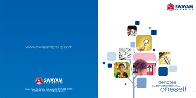
This is business company folder design. I really like the front of it. I'm guessing the tree means something to the company. The tree takes up a good amount of space too. They have their logo at the top right like most folders do. On the back they have their website, logo at the bottom, and some more information at the bottom like an address. I noticed that the back is all blue with white font and the front is all white with blue font. That's something I could do with my folder because my logo's colors are blue and white.

Thursday, April 19, 2012

Insurance Company Folder

Insurance Company folder design samples
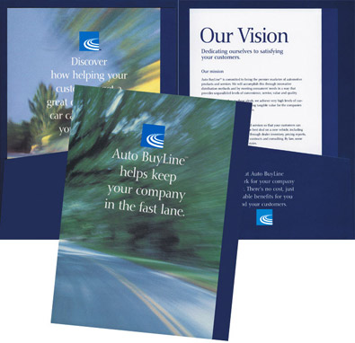
This is a insurance company's folder. They have a blue inside and on the right pocket they have a saying and their companys' logo. On the back of their folder they have a picture of a blurry road like someone was driving on it, and they have their logo with another saying below it. It's an interesting folder. It's a simple design, but I think it's a pretty good design.

Wednesday, April 18, 2012

Business Folder

I am done posting about magazine ads, now it's time to move on top business folder and flyers design. I have completed my one page and two page magazine ad. Hopefully my teacher and my classmates like my final results. My next task is to create a business folder and a flyer. So I am going to be looking up business folders and flyers.

                              
 I'm not sure what not which one is the
Corporate business folder design portfolio
 back/front and which one is the inside
 part. Their business is mediation services. This design is mainly white with a pop of color. They have blue and orange circles overlapping to from the color yellow. Then on the other side they have information about their company in blue. 


This design is mainly blue with some orange and white. On the one side, which I think is 
the front side has their business name and logo. Then they ave three pictures on the side, two of people and the third of a symbol. There also have a phrase what the bottom of their picture. They repeated their two circles, but this time it's orange and white overlapping to create yellow. They took the logo (three circles) and repeated them throughout the design of the folder. On the other side, which I think is the back, they have their website. At the bottom they have the business name and logo again, and some other information.

I like how the blue one is design. It's rather simple, but it's professional looking.
                                           

Monday, April 16, 2012

Oreo Ad

This is a magazine ad in a graphic designer’s book. They are advertising Mini Oreo. Most people know that Oreos go great with milk, and they usually show Oreos next to milk. This time since it's a mini Oreo they showed it next to a package of creamer to show how small the Oreo is.
It is a very simple ad, but I think it gets the point across. It's a white background with the mini Oreo next to the creamer and the only words on the ad are "Mini Oreo." I think this ad works.

Hand attached to Machine


 These are magazine ads in a graphic designer’s book. They are advertising handcrafted boots and shoes. The point they are trying to make is that there products are handmade. They show a real human hand attached to a sewing machine and the hand is actually doing the sewing.


They show a hand wiping something off, like maybe a boot.  Then they show a hand hammering something down instead of the machine doing it. I think it’s a little creepy that they have a hand attached to a machine doing the work. This ad would certainly not be in a kids or animals magazine. I could see this in a shoe or a hunting/fishing magazine. I get the point that they are trying to make, which is that the boots are handcrafted, so they actually put a hand attached to the machine. I still find it a little creepy and strange.  

Toyota Prius V

This was on the back of Rolling Stones magazine. It is an ad for the new Toyota prius v. At the top it says, "v is for versatile." So they took the v  in pruis and turn it into another word. They show the car and then they show a lot of stuff coming out of the truck. The stuff they show is color coordinated too, it goes from brown to orange to green to pink and to purple. Some of the stuff they show is toys and furniture.
I think it is a good advertisement. They did something different, and I think it gets the message across. The background is mainly white and then they add that pop of color.

Sunday, April 15, 2012

Once Upon a Time

This is a two spread page magazine ad for the television series, Once Upon a Time. The one page shows one character, which is Rumplestiltskin and the other page shows the Evil Queen. The only words are the shows' name and when it premiers on television.
I think the point of this ad is to promote their show to try to get people to watch it. This ad isn't one of my favorite ones. I wish they could have explain the show or shown a picture from the storyline I know how they Evil Queen is, but not Rumplestiltskin. People may not know who these characters are, but then again that might be the whole point of them designing the ad that way, so people would watch the show to find out who the characters are.  

Monopoly

You don't see many advertisements for board games. This is a magazine ad for the board game Monopoly. Instead of showing the actual game, they showed the game being played in real life. The guy in this picture is sad because his car (one of the pieces in the game) got towed away. In the right corner they show the Monopoly logo and next to it says, "Be careful where you land." They are saying that you have to be careful where you land on the board because it could be bad.
I like this ad a lot. I think it is very clever, and I liked how the did something different instead of showing the actual game board.

Snickers

This is a Snickers magazine ad in Rolling Stones. Some people might not know what they are advertising at first, but they will soon. The whole point they are trying to make is, what candy would you want if you were trick 'or treating? They show an adult holding a bowl full of Snickers bar and then they show that same adult as a kid outside their door looking in. They don't have a lot of words either. They have a small picture of their product in the right corner and next to it says, "It's what you would want."
I really like this ad and whoever created it did a wonderful job. The picture says it all, you don't need a lot of words to go with this ad.

Old Spice

This is a Old Spice ad in Times magazine. It is a very interesting way to advertise deodorant. The point they are trying to make is that there is a man inside you. They show a guy that is a "nerd" in the library and then they show a guy that is a rockstar. They are saying that if you wear Old Spice, it will bring the man out it you.
I think it is a good ad.

Swimsuit Calendar

I forget what magazine this was in. This was an ad for Sports Illustrated Swimsuit 2012 Calendar. They showed a tablet covered up with bathing suit tops, and if you looked closely between the tops you can see a girl some what naked on the screen. At the top of the ad it says, "On February 14 the bikinis come off."
I thought it was a clever way to show it because they covered up the tablet showing that February 14 isn't here yet, but it will be soon.

Sunday, April 8, 2012

Audio Books

 It's a little hard to see, and it even took me a while to realize it. It looks like music is playing, but there are words inside the bars and lines that make up a story.
This is a audio book company where people can listen to their books instead of actually reading them.
I thought this was a very clever way to show what audio books actually do. The only thing I would do different is make the logo/company bigger, so people know what it is. I don't like how small the company's name is down at the bottom. It took me a while to find the company's name.

LEGO Advertisement

 This was a real life ad in a graphic designer's book. It looks like a part of the building is missing a piece. It's actually a giant decal or bulletin board. I think this is a very clever advertisement. It throws people off at first.
Well done LEGO.

Saturday, April 7, 2012

App for Android

                               This is a magazine ad in TIMES. It's not promoting a phone, but an app for a phone. It's the CNN Money app where you can get breaking news, track real-time market data, and follow your personal stocks. Then it actually shows that app being used on a phone. It says you can download the app for free, but that's probably just a trial version or doesn't have all the features.
I think it is an affective ad. This is a good ad to put it TIMES magazine since it covers news from politicians, to pop culture, to the entertainment industry to celebrities, and other important news.

Bike Lock

It took me a while to realize what the purpose of this ad was, but I eventually got it. They are advertising their bike lock chain. They are saying that no one will steal a person's bike because their lock is that good. They have a picture of a bike conjoined with a pole to show that no one will steal it. I think it's a clever ad. It makes you think, but not for too long. There are no words on this ad except for the words on the product, which is at the bottom right hand side.  

Orange Juice Ad

This is another magazine ad in a graphic designers book. It's a orange juice ad. They have cut oranges up into different shapes like a bone, fish, and toast. At the bottom of the ad next to the orange juice it says, "It's more than orange juice." I think what they are trying to say is that you can have orange juice with any type of food, and that it has good stuff in it too.
The ad is a little confusing, but I think I get it. 

How did the Chicken cross the Roads?

This was a magazine ad in a graphic designers book. The ad is for Perdue Chicken. They have animated the ad, which I think is interesting because it's different from other ads. The story behind the ad is, "How did the chicken cross the road?" Well they show you how the chicken crossed the road, he/she dug a tunnel under the road so he/she could get across safely. The whole point behind the ad is that Perdue's chickens are smarter and healthy than other chickens because they aren't fed steroids, growth hormones, or any other type of "bad products."

Wednesday, April 4, 2012

I don't get it.


This was a magazine ad in a graphic design book about advertisements.
I still do not understand what the purpose of this ad is. I don't know who the guy on the right is. I know it has to do with MTV, but that's all I know. I watch a lot of MTV and I still don't get this ad. I guess a person would have to know who both of these people are and how they are connected to each other.
I don't like this magazine ad. This ad would only work in a music based magazine or a history one (maybe; if that). If I don't get the purpose of an ad within a few seconds or a few minutes, and I have to keep trying to figure out what the purpose is then it's a poor ad.
My guess is that the ad has to do with new technology like new phones, or music broadcasting through the television.


At the bottom it says: On the left: Alexander Graham, inventor of the telephone

5 Gum Magazine Ad

These are both 5 gum magazine ads in Rolling Stones. I noticed that they are pretty similar; they both have a sentence above their product (different flavors though). I noticed that in the first one they mention pianos and how they all strike the same cord, which is good saying because it's related to music since it's a music based magazine.
This one doesn't have anything to do with music, but it still relates to their other sayings (adrenaline, power). I think these magazine ads are rather simple, but effective.

Sunday, April 1, 2012

Paint AD

This is a magazine ad in a graphic designer book. It is advertising paint. I didn't realize it at first, but the guy is sitting on the wood that he just painted to paint the other part of the wood because the paint dries that fast. On the paint can it says "Quick Dry." I think this is a clever magazine ad because people will realize that the paint dries really fast (at least that's what it says), and they would want to buy the paint. I think they did a good job advertising on how fast their paint dries.

Adobe AD

This is an Abobe ad in a CYMK graphic designer book. I noticed how they used their symbol (the triangles) and repeated them throughout the & symbol, and throughout the page. The & symbol is all red where as the rest of the page is colorful. They even have the word color made up of their triangle logo. The word adobe is in regular print. They also have some information at the bottom of the page.
I think it's a colorful ad, and I think the ad works because adobe products deals with creating things, editing things, and adobe has a lot of different products (like photoshop, illustrator, creative suite).

4 Page Verizon Magazine AD

 This is a four page Verizon magazine ad in Rolling Stones. They were advertising a new phone. The first page had a picture of the phone with headphones in it and it said "SEE IT."


The next two pages had their phone smashing through glass and it said "HEAR IT."

It's cool how the page looks like broken glass, but people might associate the broken glass with screens breaking on the phone, which isn't a good thing to advertise. 
The last page has the most going on. It says "EXPERIENCE YOUR SOUND LIKE NEVER BEFORE." It has their phone again and the glass is shattered more this time.

They have some text at the very bottom of the page. I think it appeals to people who like to listen to music on their phone considering that this is a music based magazine.

I don't know why they needed four pages to get their message across though. I like how the last page is set up, but I don't know if I would have choose the broken glass or not.