I am done posting about magazine ads, now it's time to move on top business folder and flyers design. I have completed my one page and two page magazine ad. Hopefully my teacher and my classmates like my final results. My next task is to create a business folder and a flyer. So I am going to be looking up business folders and flyers.
I'm not sure what not which one is the
back/front and which one is the inside
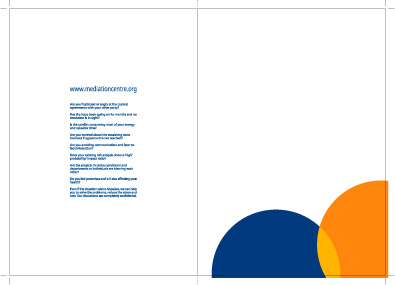
part. Their business is mediation services. This design is mainly white with a pop of color. They have blue and orange circles overlapping to from the color yellow. Then on the other side they have information about their company in blue.
the front side has their business name and logo. Then they ave three pictures on the side, two of people and the third of a symbol. There also have a phrase what the bottom of their picture. They repeated their two circles, but this time it's orange and white overlapping to create yellow. They took the logo (three circles) and repeated them throughout the design of the folder. On the other side, which I think is the back, they have their website. At the bottom they have the business name and logo again, and some other information.
I like how the blue one is design. It's rather simple, but it's professional looking.


No comments:
Post a Comment