Wednesday, February 29, 2012
Bad Envelope Design?
I don't really like the design of this envelope, I feel like it's too top heavy. I wonder how the post office feels about there being color where the stamp should go. I guess someone can probably still put a stamp over top of it. I think the company should have design something on the bottom right. My teacher told me not to use big blocks of color on the back flap, which this company did. So does that make this a poor designed envelope? I don't like how the company use a big block of green going across the top front and then a big block of green on the back, I think it's too much. Also, the envelope design looks boring to me. They need to get rid of the big blocks of color and do something else.
Tuesday, February 28, 2012
Envelope in the Mail
I got this in the mail today. It's a single window envelope. It looked like a letterhead inside and the National Aquarium was trying to get people to sign up to be a member of the aquarium and listed special prices.
I noticed that their logo and address was printed on the top left corner. They didn't print anything on the top right because that's where a stamp would go. The bar code was actually inside the envelope, but you can see it through the window. I noticed that they had a design toward the middle on the right. They didn't have any design on the back.
I like where they put their logo at, but I wish they would of done something on the back. They did use a lot of space on the front to design, which was good.
Monday, February 27, 2012
Regular Envelopes
The size of a regular #10 business envelope is 4 1/8" x 9 1/2"
This style, known as Regular envelopes simply means that it is a closed face envelope with no window. They are the most common used in business to send letters, invoices, checks, and other mailings. The #10 size envelope is the most widely used envelope of them all.
http://www.actionenvelope.com/ae/control/category/~category_id=REGULAR
#10 Square Flap Envelopes (4 1/8 x 9 1/2)
Regular Envelopes
http://www.actionenvelope.com/ae/control/category/~category_id=REGULAR
#10 Square Flap Envelopes (4 1/8 x 9 1/2)
Saturday, February 25, 2012
Vistaprint
http://www.vistaprint.com/vp/ns/default.aspx?mk=vistaprint&ad=e&GP=2%2f25%2f2012+5%3a08%3a09+PM&GPS=2365585433&GNF=1&GPLSID=
Vista print is a really awesome site. My mom got her business cards through here. She got about 250 cards for under $20. They already have hundreds of templates and designs for the cards. You can pick a design and upload your information on it or you can create your own design. They have a high quality prints too. Their business cards look really great.
If you own your own business and want to create a business card for it then this is the site to go to. Not everyone is a designer, so this site really helps.
Goooooogle Business Cards
I think this is a clever business card idea. It looks like the google search page. It has the company information on it like the phone number, and the website. It even says that it's family owned for 20 years, and some other information. They even have facebook business cards too.
I don't know if these business cards count as a "good" or "bad" card, but I think they are creative.
Thursday, February 23, 2012
Your Business Card is Crap!
http://www.youtube.com/watch?v=4YBxeDN4tbk
This is everything you shouldn't do in a business card.
His face is cut in half on the edge of the card... It's die-cut...it's $4 per card...its a pop-up...and it doesn't fit in a normal size wallet. No one is going to carry this around because it's too big and doesn't fit in a wallet/pocket. Yes it is a creative buisness card, but it will proabably be more annoying to carry around and then people will throw it out.
There is so many real estate agents that have business cards with their face on it. Wouldn't that be expensive to print out? That's a lot of colors they are using. I wouldnt want a business card with someone's face on it. Especially if it's a old guy or someone who looks creepy. Half the time the pictures of the people aren't even good! Some of them aren't smiling or at least their trying to smile, but it doesn't look good. I agree with my teacher that putting your face on your business card is not a good idea, especially if it's right on the edge and your face is being cut in half.
http://realestatecardspro.com/insurance-realtor-business-cards.php
Critique
For the most part critiques help students. I liked when we did the critique in class because I got to see what other people did for their logo and letterhead. Some people did a really nice job, and other people still needed to do a lot of work. It was nice that people got to say what they liked/disliked about someones work and how they could improve. Sometimes your work looks different printed out and from far away. Sometimes your work looks good on the screen, but not so much after it's printed. After people critique my work I know what they like and didn't like. Now I can improve my work and make it better.
Tuesday, February 21, 2012
4/0, 4/1, 4/4
I don't think I've heard 4/0, 4/1, or 4/4 on a bussiness card before. I knew it had something to do with colors though because of CYMK mood.
I learned that 4/0 means that there are 4 colors on the front and 0 colors on the back
4/1 means that there are 4 colors on the front and 1 color on the back
4/4 means that there are 4 colors on the front and 4 colors on the back.
The cheapest one is the 4/0. The more colors you have on both the front and back of the card, the more expenisve it will be. For my denwa business card, I will use the 4/0 colors.
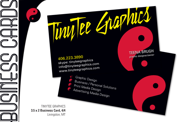
4/4
4/4
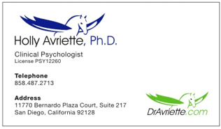
I think this is a 4/1
4/0
Monday, February 20, 2012
Edible Business Cards
I have never heard of edible business cards before, until today during class.
Beef Jerky Business Card
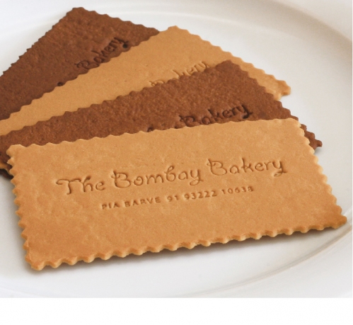
Cookie Business Card
Die Cut Metal http://www.blogcatalog.com/blogs/business-card-deoxyribonucleic-acid/
The metal business cards of Camiel Van Druten from VeelBeter, sports physiotherapists based in the Netherlands. Laser etched name and phone details with the logo designs die cut. Produced on a solid sheet of .5 mm thick stainless steel, these business cards could potentially be used for a couple of centuries
Dog Biscuits
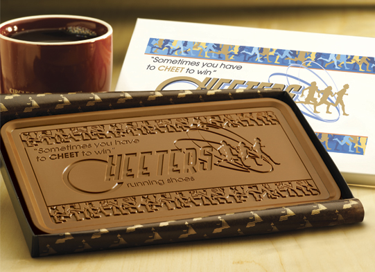
Chocolate Card
"You can also send in the actual business card for us to adhere to the back of each edible version so your contacts will get something to eat and something to keep!" - Now that's a good idea.
http://www.goodfortunes.com/Edible_Business_Cards_p/gpicb12bc.htm
Beef Jerky Business Card
Cookie Business Card
The metal business cards of Camiel Van Druten from VeelBeter, sports physiotherapists based in the Netherlands. Laser etched name and phone details with the logo designs die cut. Produced on a solid sheet of .5 mm thick stainless steel, these business cards could potentially be used for a couple of centuries
Dog Biscuits
Chocolate Card
Fortune Cookie Business Card
Edible frosted cookie business card.
It's a real site and you can actually order business cards from here. It's a very creative idea, but how long would they last? I know if I had one I would take a picture of it then I would eat it. I think if someone did do an edible business card they should include a real one with it too. How would you carrying these around without them melting or going bad though? People would probably remember the company though, especially if it was a bakery.
"You can also send in the actual business card for us to adhere to the back of each edible version so your contacts will get something to eat and something to keep!" - Now that's a good idea.
http://www.goodfortunes.com/Edible_Business_Cards_p/gpicb12bc.htm
Sunday, February 19, 2012
The Golden Arches
The golden arches. You don't see the original restaurant’s architecture much anymore, but it was part of the original design. They still kept the arches by incorporating into their logo. A giant yellow "M" is the logo for McDonald's. It's so simple, yet almost everyone knows what it is. I'm pretty sure that the McDonald's corporation has copyrights to the certain red and yellow color in their logo.
Mustang Logo
I love the Ford Mustang logo mainly because I love Mustangs, but it's also an awesome logo. What is neat about the logo is that someone can change the color of the logo and it still remains the same logo. Like these mustangs here. I have seen many different mustang logos including patriotic, flames, skulls, different colors, rainbow, and many more unique ones. You can't do that with most logos.
Thursday, February 16, 2012
Denwa Logo
Denwa means telephone in Japense.
http://www.logosdatabase.com/logo/denwa_76260320
There are other companies that are named denwa, and they are telephone companies. I found this logo. I like it for the most part, but I would rework some things. First of all I would make the curve in the front lighter than the rest of the words. I would make the curve be apart of the line in the A. I like how the curve is part of the N, but I think it needs to be worked in with the other letters more.
I think this is a real company, but I'm not sure.
I also found another denwa named company. I like this logo for the most part. I really like the w and how that stands out. I also noticed how close the letters are in the logo.
I think making a logo for anything is extremely hard because there is already so many logos out there, and someone will get accused of "copying" another logo.
Subscribe to:
Posts (Atom)