There are many different types of letterheads. Some are bad, others are really creative.
 I can tell from this letterhead that this is a fancy company. I like how they used the same design on their business cards too.
  I like the curves on the sides of this letterhead and I also like the watermark. I think watermarks are neat because it's a light background and it really makes the page stand out. And it's light enough that you can write on top of it.
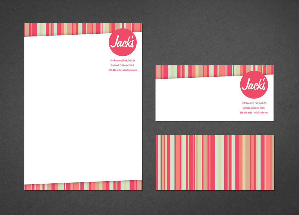
 I really like this letterhead too, something about the stripes and how it's position on the page. The design is simple. I think the colors go nice together too. They also used the same design for other items.
No comments:
Post a Comment